CSS Grid Introduction
The CSS Grid Layout introduces a 2D grid system to CSS which can be used to layout whole pages areas as well as small user interface elements. This technical document introduces some basic Grid controls as well as some new terminology that is part of the CSS Grid Layout specification.
For a more detailed explaination please visit Mozilla Developer Network which gave the inspiration for this page.
What Is A Grid
Similarly to a spreadsheet, a grid is an intersecting set of horizontal and vertical lines – one set defining columns and the other rows. Elements can be placed onto the grid in relation to these column and row lines. The following features are available in the CSS Grid Layout component:
- Fixed and flexible cell sizes
- Item placement
- Creation of additional row/columns to hold content
- Alignment control
- Control of overlapping content
You can create a grid with fixed column/row sizes – using pixels for example - setting the grid to the specified size. It is also possible to create a grid using flexible sizes (use % or the new "fr" unit designed for this purpose).
Items can be placed into precise locations on the grid using line numbers, names or by targeting an area of the grid. The Grid system can also use an algorithm to control the placement of items not given an explicit position on the grid.
As mentioned above, you can define an explicit grid with grid layout however, the specification also deals with content added outside of a declared grid - adding additional rows/columns when needed. Features such as adding “as many columns that will fit into a container” are included.
The Grid controls allows alignment configuration to control how the items align once placed into a grid area, and how the entire grid is aligned.
More than one item can be placed into a grid cell or area, they can partially overlap each other. This layering may then be controlled with z-index property.
As you can se, Grid is a powerful tool. If combined with other parts of CSS such as flexbox it can help you to create layouts that were previously impossible to build in CSS. It all starts by creating a grid in your grid container.
The Grid Container
We create a grid container by declaring display: grid or display: inline-grid on an element. As soon as we do this all direct children of that element will become grid items.
In this example, I have a containing div with a class of wrapper, inside are five child elements.
<div class="wrapper">

                <div>One</div>

                <div>Two</div>

                <div>Three</div>

                <div>Four</div>

                <div>Five</div>

          </div>
and we make the .wrapper a grid container.
.wrapper {

                display: grid;

        }
The above code would give a grid that is 1 column wide with 5 rows
All direct children are now grid items. If viewed nn a web browser, the avbove code would look the same with or wihtout the Grid container - the grid has created a single column grid for the items. As you learn and then work with the CSS Grid Layout this tool will give you a better idea of what is happening with your grids visually. If we want to start making this more grid-like we need to add more columns.
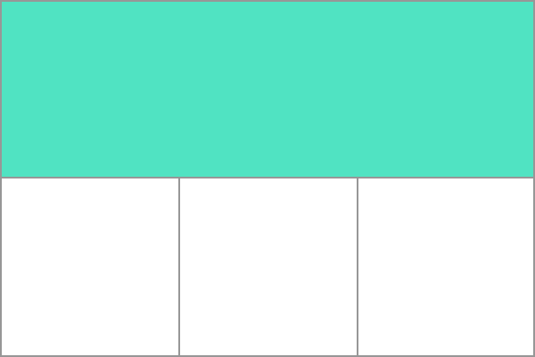
Grid Tracks
In order to develop our Grid container, we need to define rows and columns using the grid-template-columns and grid-template-rows properties. These define grid "tracks" - space between any two lines on the grid (cf railway tracks). In the below image you can see a track highlighted – this is the first row track in our grid.
We can add to our earlier example by adding the grid-template-columns property, then defining the size of the column tracks.
<div class="wrapper">

              <div>One</div>

              <div>Two</div>

              <div>Three</div>

              <div>Four</div>

              <div>Five</div>

        </div>
.wrapper {

              display: grid;

              grid-template-columns: 200px 200px 200px;

        }
This will createe a grid with three 200-pixel-wide column tracks. The child items will be laid out on this grid one in each grid cell.
Further details can be found on the Mozilla Developer page for te grid funcitonality
Grid Lines
You should be note that when we define a grid we define the grid tracks, not the lines. We then poisiton items using the numbered lines provided by Grid. In our three column, two row grid we have four column lines.
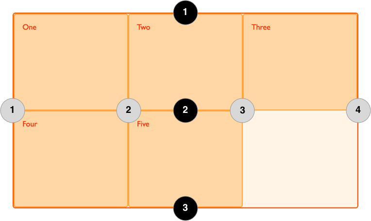
NOTE: Lines are numbered according to the writing mode of the document (in a left-to-right language, line 1 is on the left-hand side of the grid. In a right-to-left language, it is on the right-hand side of the grid). You can also name lines but this is not covered in this documentation.
In the following example the first two items are placed on our three column grid, using the grid-column-start, grid-column-end, grid-row-start and grid-row-end properties. Working from left to right, the first item is placed against column line 1, and spans to column line 4, which in our case is the far-right line on the grid. It begins at row line 1 and ends at row line 3, therefore spanning two row tracks.
The second item starts on grid column line 1, and spans one track. This is the default so I do not need to specify the end line. It also spans two row tracks from row line 3 to row line 5. The other items will place themselves into empty spaces on the grid.
<div class="wrapper">

      <div>One</div>

      <div>Two</div>

      <div>Three</div>

      <div>Four</div>

      <div>Five</div>

</div>
.wrapper {

      display: grid;

      grid-template-columns: repeat(3, 1fr);

      grid-auto-rows: 100px;

}


.box1 {

      grid-column-start: 1;

      grid-column-end: 4;

      grid-row-start: 1;

      grid-row-end: 3;

}


.box2 {

      grid-column-start: 1;

      grid-row-start: 3;

      grid-row-end: 5;

}
Further details can be found on the Mozilla Developer page for the grid funcitonality
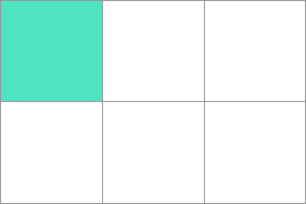
Grid Cells
A grid cell, the smallest unit on a grid, is conceptually equivalent to a table cell. Our previous examples show that, once a grid is defined as a parent the child items will lay themselves out in one cell each of the defined grid. In the below image, I have highlighted the first cell of the grid.